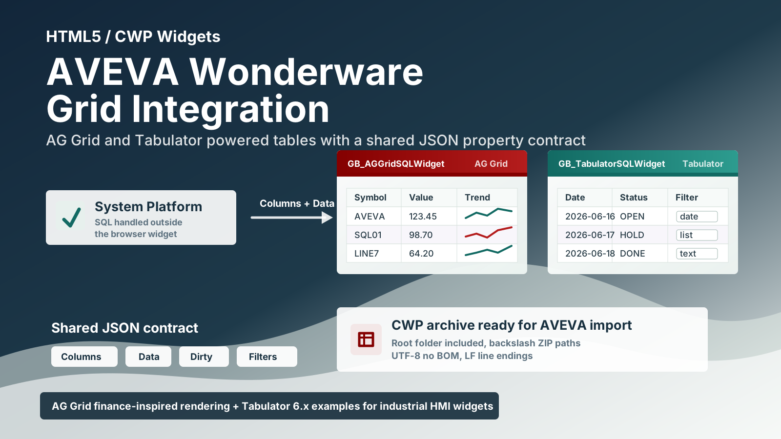
This repository contains three HTML5/CWP widgets for AVEVA Wonderware / AVEVA System Platform:
GB_AGGridSQLWidget.cwp, based on AG GridGB_AGGridSQLWidget_mod.cwp, a modified AG Grid build available from GB_AGGridSQLWidget_mod.cwpGB_AGGridSQLWidget_mod2.cwp, a second modified AG Grid build available from GB_AGGridSQLWidget_mod2.cwpGB_TabulatorSQLWidget.cwp, based on Tabulator 6.x
All widgets expose common properties so the same HMI/System Platform logic can feed each grid with JSON column definitions and JSON row data.
Design Goals
The widgets are designed for AVEVA environments where SQL access and business logic are handled outside the browser widget.
The widget itself:
- does not open direct SQL Server connections
- does not use
fetchorXMLHttpRequest - reads data from the
Datawidget property - reads column definitions from the
Columnswidget property - writes edited rows back to
Data - sets
IsDirtytoTruewhen a cell edit changes the dataset
This keeps the browser widget focused on visualization and editing, while the HMI/System Platform layer remains responsible for acquiring and publishing data.
Included Widgets
GB_AGGridSQLWidget
GB_AGGridSQLWidget uses AG Grid Community with the Quartz theme. It follows the finance-style AG Grid example approach: a dense, high-performance grid suitable for structured operational or financial data, with sortable/filterable columns, editable cells, formatting, selection styling, and column sizing.
The CWP archive contains:
GB_AGGridSQLWidget/
  index.html
  widget.wjson
  README.txt
  build/
    build.min.css
    build.min.js
  resources/
    libs/
      ag-grid-community.min.js
      ag-grid.css
      ag-theme-quartz.css
Main implementation notes:
- AG Grid is loaded from
./resources/libs/ag-grid-community.min.js - the widget uses
ag-theme-quartz - filtering is controlled by
IsFilterable - editing is controlled by
IsEditable - dropdown editors are mapped to AG Grid select editors through
ColumnsOptions - column metadata is compatible with field names such as
prop,name,title,size, andminSize
Click to show GB_AGGridSQLWidget_mod updates
GB_AGGridSQLWidget_mod
GB_AGGridSQLWidget_mod is a modified AG Grid CWP widget for AVEVA Wonderware / AVEVA System Platform. It keeps the same external data contract as the standard AG Grid widget while adding color fixes, conditional cell styling, and parsing improvements for AVEVA-style JSON strings.
Download the modified widget archive here:
The CWP archive contains:
GB_AGGridSQLWidget_mod/
  index.html
  widget.wjson
  README.txt
  build/
    build.min.css
    build.min.js
  resources/
    libs/
      ag-grid-community.min.js
      ag-grid.css
      ag-theme-quartz.css
Widget property contract:
Columns: JSON array of column definitions.Data: JSON array of row objects.FontSize,HeaderHeight,HeaderFontSize,RowHeight: grid appearance settings.IsDirty: written by the widget when a cell is modified.IsEditable: enables or disables editing.IsDebugMode: enables console logging.ColumnsProperties: JSON array of additional per-column attributes.ColumnsOptions: JSON array of dropdown options per column.ConditionalCellStyles: JSON array of rules used to change cell text/background styling from row data.
As with the standard widgets, GB_AGGridSQLWidget_mod does not open direct SQL Server connections and does not use fetch or XMLHttpRequest. SQL Server access must be handled by the HMI/System Platform layer, which publishes rows to Data and column definitions to Columns.
Main updates in the modified version:
- Adds customizable alternating row colors.
- Adds color properties for header, rows, selected row, text, and border styling.
- Adds the
ConditionalCellStyleswidget property. - Refreshes cells after a cell edit so conditional styles are recalculated immediately.
- Accepts JSON passed by AVEVA as a quoted string.
- Accepts AVEVA strings with doubled internal quotes, such as
"[{""field"":""Value""}]". - Allows
ColumnsPropertiesto be provided either as a JSON array or as a pipe-separated list, such as{"editable":false}|{"filter":false}. - Matches conditional-style field names even when accents or case differ, for example
QuantitaandQuantità. - Honors
editable:false,readonly:true,readOnly:true,filter:false,filterable:false, andisFilterable:falsefromColumnsProperties. - Generates the CWP archive with the layout expected by
New-CwpFromFolder_CORRETTO.ps1: ZIP entries use backslashes, the root widget folder is included, and explicit directory entries are omitted.
Example ConditionalCellStyles value:
[
  {
    "targetField": "Quantity",
    "when": {
      "field": "Notes",
      "operator": "notEmpty"
    },
    "textColor": "#ff0000"
  },
  {
    "targetField": "Quantity",
    "when": {
      "field": "Quantity",
      "operator": ">",
      "value": 300
    },
    "textColor": "#ff0000",
    "backgroundColor": "#fff2cc"
  }
]
Supported conditional-style fields:
- target field aliases:
targetField,target,column - condition fields:
when.field,when.operator,when.value - positive style fields:
textColor,color,backgroundColor,bgColor,fontWeight,fontStyle - fallback style fields:
elseTextColor,elseColor,elseBackgroundColor,elseBgColor,elseFontWeight,elseFontStyle
Supported operators:
notEmpty, empty, notNull, isNull, equals, notEquals, contains,
startsWith, endsWith, in, notIn, >, >=, <, <=
Click to show GB_AGGridSQLWidget_mod2 updates
GB_AGGridSQLWidget_mod2
GB_AGGridSQLWidget_mod2 starts from the GB_AGGridSQLWidget_mod behavior and adds the runtime features needed to read the selected row/cell from HMI scripts and to control editability/filterability more strictly from widget properties.
Download the MOD2 widget archive here:
Versioned release package:
GB_AGGridSQLWidget_mod2_RELEASE_v2026.08.21_1232.7z
Versioning rule for AVEVA Wonderware: the importable CWP file must keep the exact name GB_AGGridSQLWidget_mod2.cwp, and the internal widget name must remain GB_AGGridSQLWidget_mod2. Versioning is applied only to the external release folder/package, never to the CWP file name used for import.
The CWP archive contains:
GB_AGGridSQLWidget_mod2/
  index.html
  widget.wjson
  README.md
  build/
    build.min.css
    build.min.js
  resources/
    libs/
      ag-grid-community.min.js
      ag-grid.css
      ag-theme-quartz.css
Additional widget properties in mod2:
SelectedRowIndex: index of the last clicked/edited row, or-1when unavailable.SelectedColumnField: field name of the last clicked/edited cell.SelectedCellValue: value of the last clicked/edited cell as a string.SelectedRowData: complete selected/edited row as a JSON string.
Selection properties are updated on cell click, row click, selection change, and cell edit. Row events update SelectedRowData and SelectedRowIndex without clearing the last cell field/value produced by a cell event.
Suggested HMI wrapper bindings:
GB_AGGridSQLWidget_mod2.SelectedRowIndex = SelectedRowIndex
GB_AGGridSQLWidget_mod2.SelectedColumnField = SelectedColumnField
GB_AGGridSQLWidget_mod2.SelectedCellValue = SelectedCellValue
GB_AGGridSQLWidget_mod2.SelectedRowData = SelectedRowData
Suggested custom property types:
| Property | Type |
|---|---|
SelectedRowIndex | Integer |
SelectedColumnField | String |
SelectedCellValue | String |
SelectedRowData | String |
Editability in mod2 is deny-by-default:
- when
IsEditable=False, no column is editable; - when
IsEditable=True, a column is editable only if the column definition orColumnsPropertiesmarks it with{"editable":true}; readonly:trueorreadOnly:truealways disables editing for that column;- for compatibility with production screens, quantity and production-note columns can also be recognized as editable when global editing is enabled.
Example ColumnsProperties for making only quantity and notes editable:
[
  {"filter":false,"editable":false},
  {"filter":false,"editable":false},
  {"filter":false,"editable":false},
  {"filter":false,"editable":true},
  {"filter":false,"editable":true}
]
When IsFilterable=False, mod2:
- clears active filters;
- regenerates column definitions with
filter=false; - disables floating filters;
- suppresses header filter/menu buttons;
- removes filter menu tabs and filter parameters;
- blocks click events on residual filter icons;
- hides residual AG Grid filter/menu icons with CSS on the grid container and on the embedded document root/body.
Suggested HMI wrapper binding:
GB_AGGridSQLWidget_mod2.IsFilterable = GB_AGGridIsFilterable
GB_AGGridIsFilterable = False
mod2 also keeps the previous fixes for conditional styles, AVEVA-style quoted JSON parsing, explicit column widths, font sizing, row/header colors, and dirty-data publishing.
Visual demo:
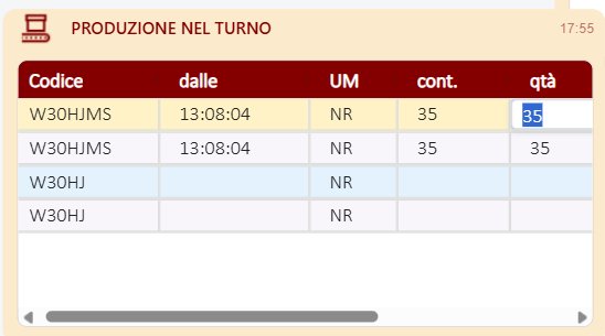
The grid can publish the selected/edited cell context while keeping the configured editability rules.

The HMI log shows SelectedRowIndex, SelectedColumnField, SelectedCellValue, and SelectedRowData populated from the selected cell.
GB_TabulatorSQLWidget
GB_TabulatorSQLWidget uses Tabulator 6.x. It follows the Tabulator examples model for interactive data tables: JSON data, editable cells, sortable columns, header filters, formatters, responsive column definitions, and local data rendering.
The CWP archive contains:
GB_TabulatorSQLWidget/
  index.html
  widget.wjson
  README.txt
  build/
    build.min.css
    build.min.js
  resources/
    libs/
      tabulator.min.css
      tabulator.min.js
Main implementation notes:
- Tabulator is loaded from
./resources/libs/tabulator.min.js - filtering is controlled by
IsFilterable - editing is controlled by
IsEditable - dropdown editors are mapped to Tabulator list editors through
ColumnsOptions - date-like columns can use an HTML5 calendar filter when
DateFilterAsCalendar=True - column metadata is compatible with field names such as
prop,name,headerName, andsize
Widget Properties
All widgets use these core properties:
| Property | Type | Purpose |
|---|---|---|
Columns | String | JSON array of column definitions. |
Data | String | JSON array of row objects. |
FontSize | Integer | Cell font size in points. |
HeaderHeight | Integer | Header height in pixels. |
HeaderFontSize | Integer | Header font size in points. |
RowHeight | Integer | Row height in pixels. |
IsDirty | Boolean | Set by the widget when edited data is published back to Data. |
IsEditable | Boolean | Enables or disables cell editing. |
IsFilterable | Boolean | Enables or disables column/header filtering. |
IsDebugMode | Boolean | Enables console logging for diagnostics. |
ColumnsProperties | String | JSON array with additional per-column options. |
ColumnsOptions | String | JSON array with dropdown/list options per column. |
HeaderBackgroundColor | String | Header background color. |
HeaderTextColor | String | Header text color. |
OddRowBackgroundColor | String | Odd row background color. |
EvenRowBackgroundColor | String | Even row background color. |
SelectedRowBackgroundColor | String | Selected row background color. |
RowTextColor | String | Row text color. |
BorderColor | String | Grid border color. |
GB_TabulatorSQLWidget also includes:
| Property | Type | Purpose |
|---|---|---|
DateFilterAsCalendar | Boolean | Uses an HTML5 date input for date-like header filters. |
GB_AGGridSQLWidget_mod also includes:
| Property | Type | Purpose |
|---|---|---|
ConditionalCellStyles | String | JSON array of conditional rules used to change cell text, background, font weight, and font style from row data. |
GB_AGGridSQLWidget_mod2 also includes all mod properties plus:
| Property | Type | Purpose |
|---|---|---|
SelectedRowIndex | Integer | Index of the last selected/edited row. |
SelectedColumnField | String | Field name of the last selected/edited cell. |
SelectedCellValue | String | Value of the last selected/edited cell. |
SelectedRowData | String | Full selected/edited row as JSON. |
Column Definitions
The Columns property must contain a JSON array. Each object describes one grid column.
Example:
[
  {
    "prop": "Symbol",
    "name": "Symbol",
    "size": 90
  },
  {
    "prop": "Description",
    "name": "Description",
    "size": 220
  },
  {
    "prop": "LastPrice",
    "name": "Last Price",
    "size": 120,
    "formatting": "decimal2"
  },
  {
    "prop": "TradeDate",
    "name": "Trade Date",
    "size": 130,
    "formatting": "date"
  }
]
Supported compatibility aliases:
| Generic field | AG Grid mapping | Tabulator mapping |
|---|---|---|
prop | field | field |
name | headerName | title |
title | headerName | title |
headerName | headerName | title |
size | width | width |
minSize | minWidth | custom column property if supported |
If Columns is empty and Data contains at least one row, the widgets infer columns from the keys in the first row.
Row Data
The Data property must contain a JSON array of objects. Object keys must match the column prop or field values.
Example:
[
  {
    "Symbol": "AVEVA",
    "Description": "Industrial software portfolio",
    "LastPrice": 123.45,
    "TradeDate": "2026-06-16"
  },
  {
    "Symbol": "SQL01",
    "Description": "Historian query result",
    "LastPrice": 98.7,
    "TradeDate": "2026-06-17"
  }
]
When a user edits a cell:
- the widget updates its internal grid data
- the complete row array is serialized back into
Data IsDirtyis set toTrue
The HMI/System Platform layer can watch IsDirty, process the changed Data, and then reset IsDirty when the change has been handled.
Formatting
The widgets support the following formatting values:
| Value | Output |
|---|---|
date | Localized date using it-IT. |
time | Localized time using it-IT. |
datetime | Localized date and time using it-IT. |
integer | Integer with localized separators. |
decimal | Decimal with localized separators. |
decimal1 | Decimal with one fixed fraction digit. |
decimal2 | Decimal with two fixed fraction digits. |
decimal3 | Decimal with three fixed fraction digits. |
Example:
[
  {
    "prop": "Quantity",
    "name": "Quantity",
    "formatting": "integer",
    "size": 100
  },
  {
    "prop": "Value",
    "name": "Value",
    "formatting": "decimal2",
    "size": 120
  }
]
Dropdown Columns
Use ColumnsOptions to define dropdown/list values by column index.
Example:
[
  [],
  [
    { "value": "OPEN", "text": "Open" },
    { "value": "CLOSED", "text": "Closed" },
    { "value": "HOLD", "text": "On Hold" }
  ],
  []
]
For a column at the same index:
[
  { "prop": "Id", "name": "ID", "size": 80 },
  {
    "prop": "Status",
    "name": "Status",
    "size": 120,
    "optionsValue": "value",
    "optionsText": "text"
  },
  { "prop": "Notes", "name": "Notes", "size": 250 }
]
AG Grid uses the option values as select editor values. Tabulator uses value/text pairs when available.
Additional Column Properties
Use ColumnsProperties to merge advanced options into each column by index.
Example:
[
  {
    "pinned": "left",
    "readonly": true
  },
  {
    "hozAlign": "right",
    "sorter": "number"
  }
]
Because AG Grid and Tabulator use different option names, keep shared column definitions simple and put library-specific options in ColumnsProperties only when the selected widget supports them.
GB_AGGridSQLWidget_mod also accepts ColumnsProperties as a pipe-separated list when AVEVA integration makes a plain JSON array inconvenient:
{"editable":false}|{"filter":false}GB_AGGridSQLWidget_mod2 uses the same formats and applies editability/filterability with a stricter final pass after all column metadata is merged. This prevents a later ColumnsProperties merge from re-enabling a filter or editor that was disabled by global widget properties.
For the modified AG Grid widget, the following column flags are recognized when present in ColumnsProperties:
editable:false, readonly:true, readOnly:true,
filter:false, filterable:false, isFilterable:false
Filtering
Set IsFilterable=True to enable filtering.
For AG Grid:
- filters are enabled at column level
- filter buttons are visible in the header
- setting
filter:falseon a column disables filtering for that column
For Tabulator:
- header filters are enabled at column level
- string columns use text inputs by default
- date-like columns can use a calendar input when
DateFilterAsCalendar=True - date-like detection uses
formatting:"date",formatting:"datetime", or labels/fields containing values such asdate,data, orgiorno
Set IsFilterable=False to clear and disable filters.
Styling
The widgets expose color properties so the same CWP can be themed from AVEVA without rebuilding the archive.
Default palette:
HeaderBackgroundColor     #840000
HeaderTextColor           #ffffff
OddRowBackgroundColor     #ffffff
EvenRowBackgroundColor    #f8f6fb
SelectedRowBackgroundColor #fef2c6
RowTextColor              #222222
BorderColor               #dddddd
Both widgets use Calibri Light first, with standard web font fallbacks.
GB_AGGridSQLWidget_mod and GB_AGGridSQLWidget_mod2 support conditional cell styling through the ConditionalCellStyles property. Rules are evaluated against row data and can update the target cell text color, background color, font weight, and font style.
Example:
[
  {
    "targetField": "Quantity",
    "when": {
      "field": "Notes",
      "operator": "notEmpty"
    },
    "textColor": "#ff0000"
  },
  {
    "targetField": "Quantity",
    "when": {
      "field": "Quantity",
      "operator": ">",
      "value": 300
    },
    "textColor": "#ff0000",
    "backgroundColor": "#fff2cc"
  }
]
Supported conditional-style fields:
- target field aliases:
targetField,target,column - condition fields:
when.field,when.operator,when.value - positive style fields:
textColor,color,backgroundColor,bgColor,fontWeight,fontStyle - fallback style fields:
elseTextColor,elseColor,elseBackgroundColor,elseBgColor,elseFontWeight,elseFontStyle
Supported operators:
notEmpty, empty, notNull, isNull, equals, notEquals, contains,
startsWith, endsWith, in, notIn, >, >=, <, <=
After a cell edit, GB_AGGridSQLWidget_mod and GB_AGGridSQLWidget_mod2 refresh cells so conditional styles are recalculated immediately. They also match field names across case and accent differences, for example Quantita and Quantità.
When AVEVA passes JSON as a quoted string, or with doubled internal quotes such as "[{""field"":""Value""}]", the modified AG Grid widget normalizes the value before parsing it.
GB_AGGridSQLWidget_mod2 additionally publishes selected-cell information to SelectedRowIndex, SelectedColumnField, SelectedCellValue, and SelectedRowData, so HMI scripts can read the current grid context without parsing the whole Data payload.
HTML Entry Point
Each widget loads the AVEVA widget proxy from:
<script src="../resources/apis/proxy.js" cwidget="widget" autoResize="disable"></script>The grid fills the full widget area:
<div id="grid"></div>For AG Grid, the element also includes the AG Grid theme class:
<div id="grid" class="ag-theme-quartz"></div>Building CWP Archives
Use CWP Archive Generator.ps1 to create the CWP archives. The script is important because it produces the internal archive layout expected by AVEVA.
The script:
- includes the widget root folder inside the archive
- writes internal ZIP paths with backslashes
- adds file entries only, without explicit directory entries
- sorts files by full path before adding them
- normalizes text files to UTF-8 without BOM
- normalizes text line endings to LF
- preserves binary files as raw bytes
- resolves relative output paths from the current PowerShell directory instead of
C:\Windows\System32
Example:
.\CWP Archive Generator.ps1 `
  -SourceFolder ".\GB_AGGridSQLWidget" `
  -OutputCwp ".\GB_AGGridSQLWidget.cwp"
.\CWP Archive Generator.ps1 `
-SourceFolder ".\GB_AGGridSQLWidget_mod" `
-OutputCwp ".\GB_AGGridSQLWidget_mod.cwp".\CWP Archive Generator.ps1 `
-SourceFolder ".\GB_AGGridSQLWidget_mod2" `
-OutputCwp ".\GB_AGGridSQLWidget_mod2.cwp".\CWP Archive Generator.ps1 `
-SourceFolder ".\GB_TabulatorSQLWidget" `
-OutputCwp ".\GB_TabulatorSQLWidget.cwp"Run the command from the folder that contains both the widget source folder and CWP Archive Generator.ps1.
Expected archive root examples:
GB_AGGridSQLWidget\index.html
GB_AGGridSQLWidget\widget.wjson
GB_AGGridSQLWidget\build\build.min.js
GB_AGGridSQLWidget_mod\index.html
GB_AGGridSQLWidget_mod\widget.wjson
GB_AGGridSQLWidget_mod\build\build.min.jsGB_AGGridSQLWidget_mod2\index.html
GB_AGGridSQLWidget_mod2\widget.wjson
GB_AGGridSQLWidget_mod2\build\build.min.jsGB_TabulatorSQLWidget\index.html
GB_TabulatorSQLWidget\widget.wjson
GB_TabulatorSQLWidget\build\build.min.jsDo not create a CWP by manually compressing only the files inside the widget folder. The archive must contain the widget root folder as the first path segment.
Import and Runtime Checklist
Before importing a CWP into AVEVA:
- verify that
index.htmlis at<WidgetName>\index.htmlinside the archive - verify that
widget.wjsonis at<WidgetName>\widget.wjson - verify that all JavaScript and CSS libraries are under
<WidgetName>\resources\libs\ - verify that text files are UTF-8 without BOM
- verify that the widget receives valid JSON strings in
ColumnsandData - verify that
IsEditable,IsFilterable, and color properties are set as expected - for
GB_AGGridSQLWidget_mod, verify thatConditionalCellStylesis valid JSON when conditional styling is used - for
GB_AGGridSQLWidget_mod2, verify the wrapper bindings forSelectedRowIndex,SelectedColumnField,SelectedCellValue,SelectedRowData,IsEditable, andIsFilterable
At runtime:
- publish rows to
Data - publish columns to
Columns - use
ColumnsOptionsfor dropdown/list editors - use
ColumnsPropertiesfor advanced per-column behavior - use
ConditionalCellStyleswithGB_AGGridSQLWidget_modfor row-data-driven cell styling - use
SelectedRowIndex,SelectedColumnField,SelectedCellValue, andSelectedRowDatawithGB_AGGridSQLWidget_mod2when HMI scripts must read the selected grid context - watch
IsDirtyto detect user edits - read the updated
Datavalue after edits
Choosing a Widget
Use GB_AGGridSQLWidget when you want an AG Grid style table with Quartz theming, fast column sizing, AG Grid filtering, and a finance-dashboard style foundation.
Use GB_AGGridSQLWidget_mod when you want the AG Grid foundation plus AVEVA-friendly parsing, customizable row/header colors, immediate conditional-style refresh after edits, and ConditionalCellStyles rules.
Use GB_AGGridSQLWidget_mod2 when you want the mod behavior plus selected-cell publishing for HMI scripts and stricter runtime control over editable/filterable columns.
Use GB_TabulatorSQLWidget when you want a Tabulator 6.x style table with header filters, list editors, local data behavior, and flexible Tabulator column configuration.
All widgets are intentionally fed through the same JSON property, so switching between them should mostly require adapting only advanced library-specific column options.